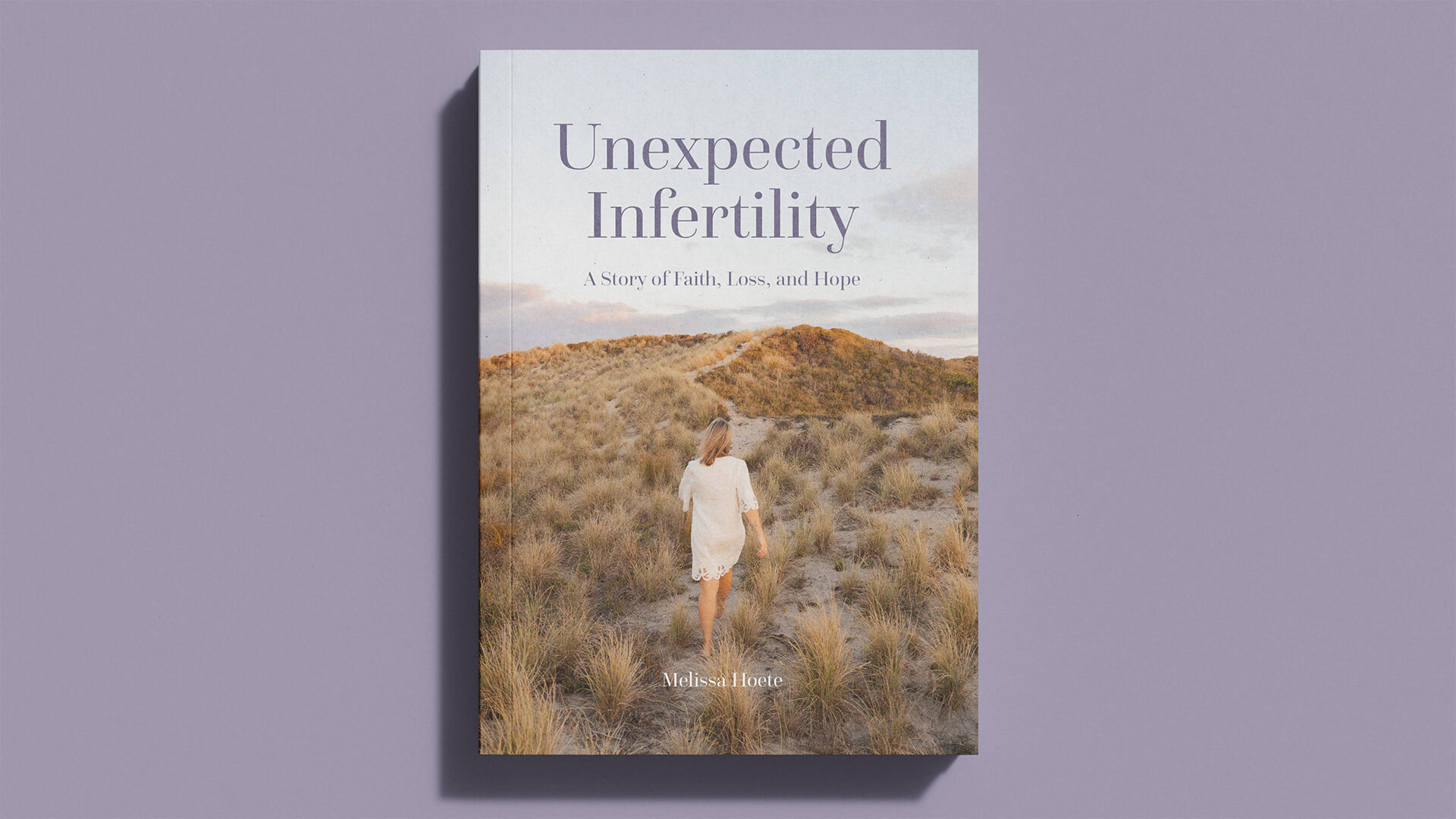
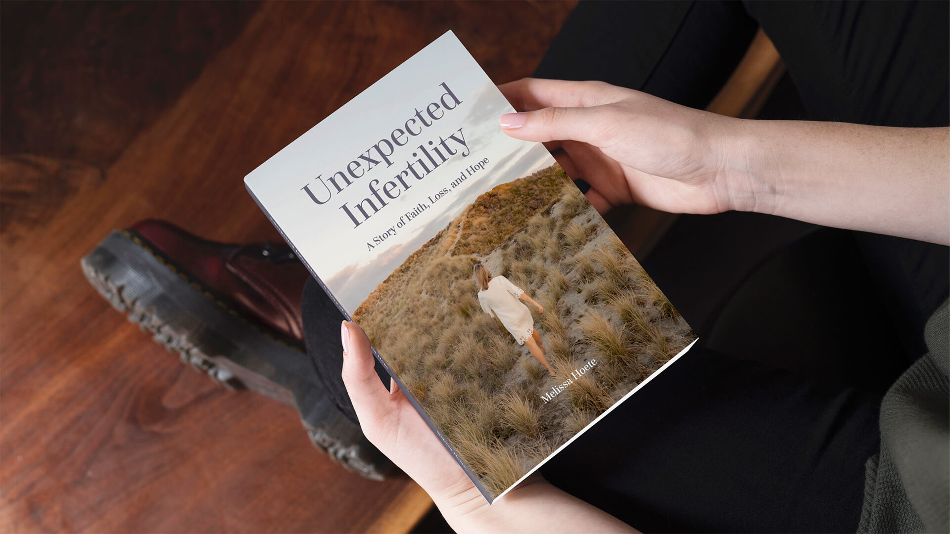
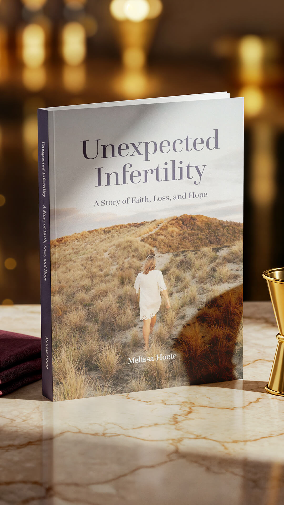
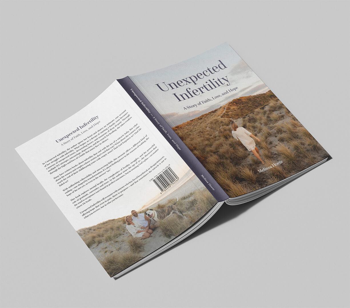
Unexpected Infertility
Location
New Zealand
The Brief
To design a deeply personal memoir surrounding infertility, faith, grief, and hope, creating a reading experience that feels intimate, calm, and emotionally honest.
The Challenge
Designing for vulnerability.
Unexpected Infertility carried emotional weight from the very
beginning. The
manuscript
moved through loss, waiting, unanswered prayers, healing, and faith, requiring a design
approach built on restraint rather than excess.
The challenge was creating a layout system that supported long form reading while allowing
the emotional rhythm of the story to breathe naturally across every page.
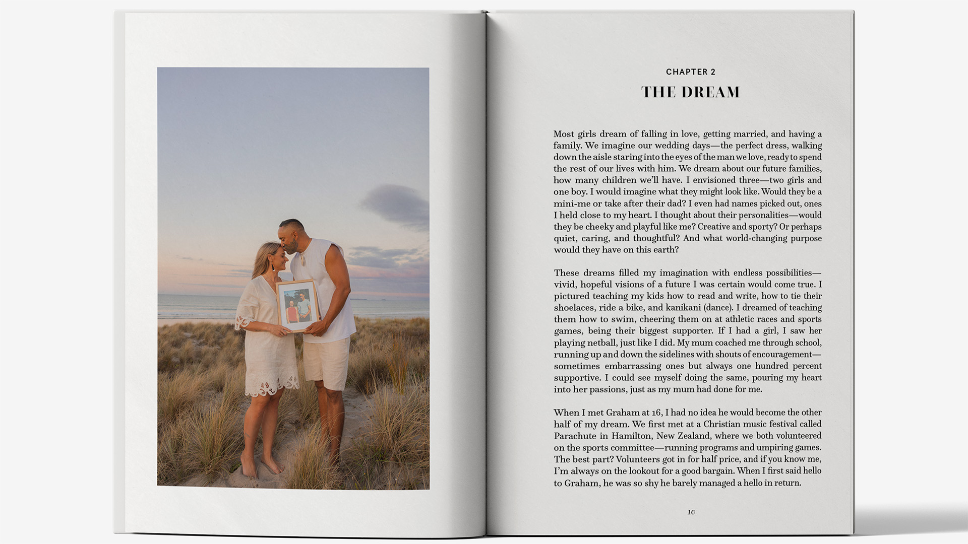
The Idea
Quiet design. Honest storytelling.
Inspired by contemporary editorial publishing and literary book design, the visual direction
leaned into simplicity, intentional spacing, and refined typography. Rather than competing
with the narrative, the design was built to support it.
Typography played a central role throughout the project using
Questa Grande
and Questa Sans
to create warmth, clarity, and softness across both display and body text
systems.
Chapters were approached as quiet pauses within the story, allowing moments of reflection
before moving into the next part of the narrative. The result feels less commercial and more
personal, closer to a journal or testimony than a traditional memoir.
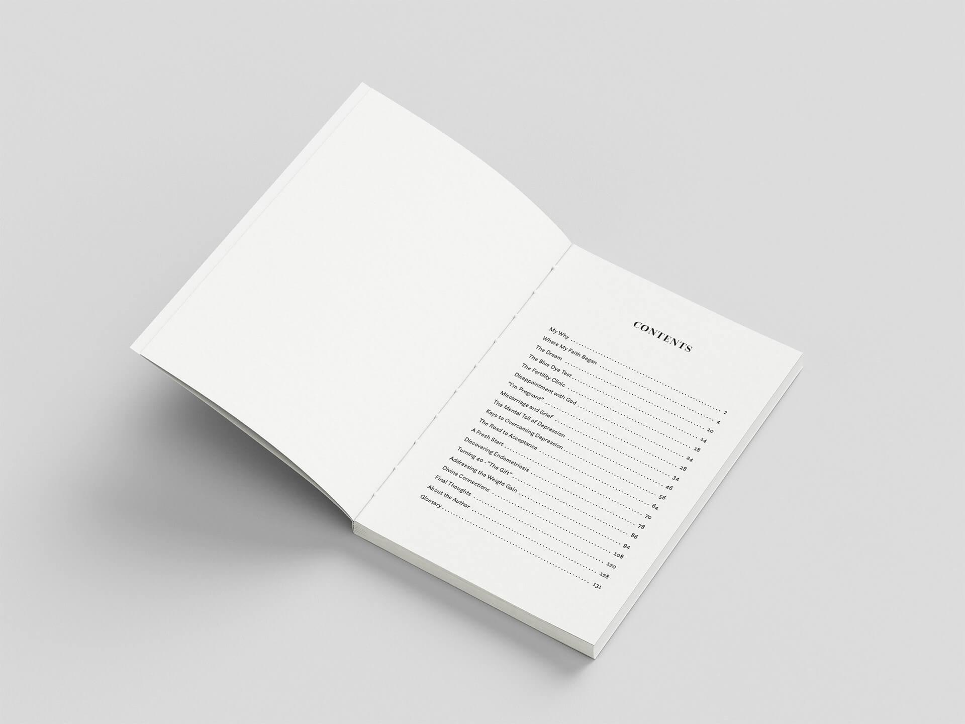
The Result
A restrained editorial book design that brings dignity and softness to a deeply personal story.
The final outcome transforms personal testimony into a tactile reading experience shaped by
calm pacing, refined typography, and thoughtful editorial structure. Every detail was
designed to carry the story carefully while maintaining readability, emotional depth, and
visual restraint from cover to cover.
Words from Melissa