Hope Harbor
Location
United States
The Brief
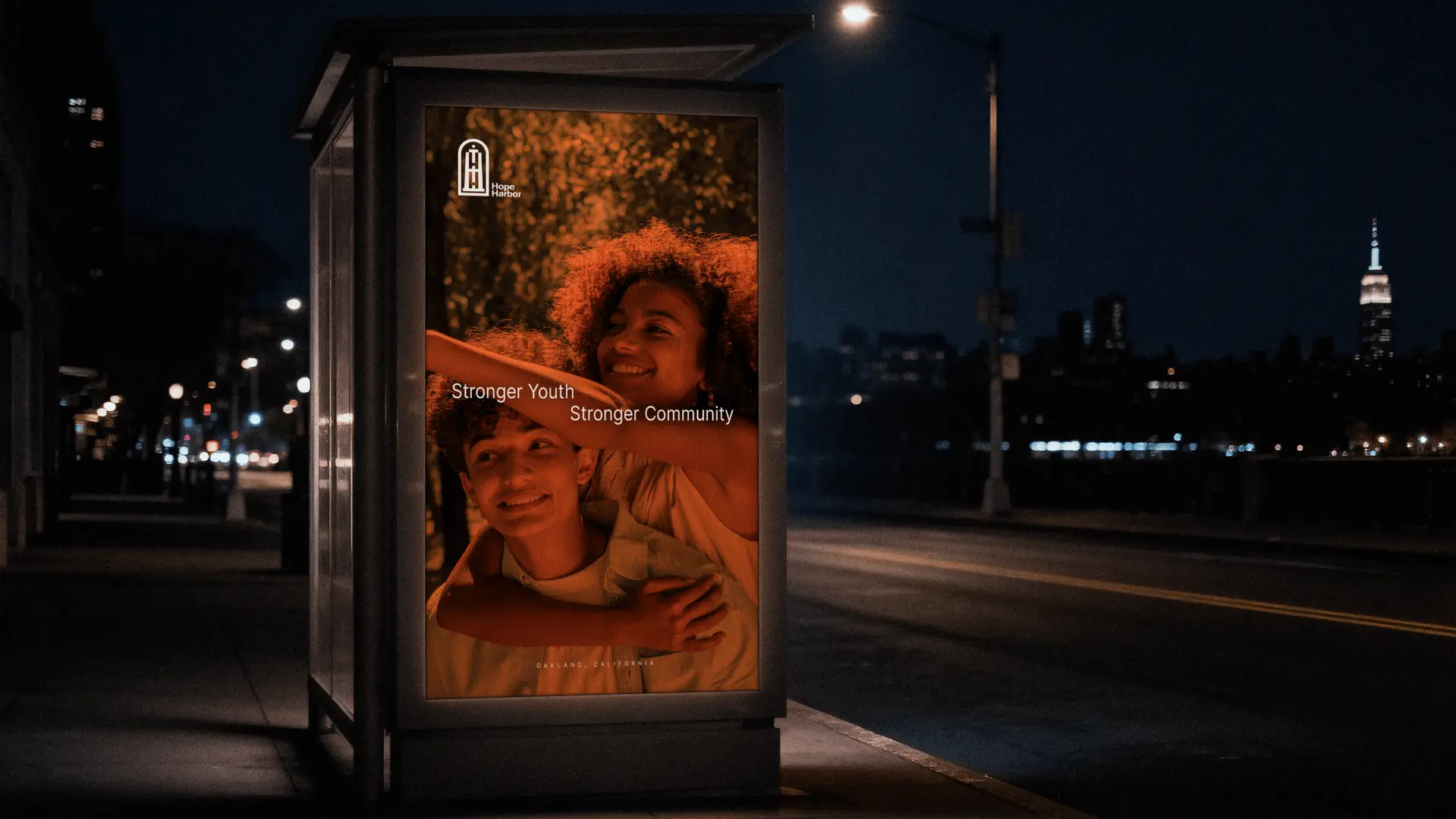
To craft a vibrant, hopeful brand identity for an Oakland-based youth nonprofit, balancing approachable warmth for young participants with the clarity and trust needed to rally community donors.
The Vision
A safe place.
Too many young people grow up without the support systems they need to navigate life’s
hardest turns. When mentorship and community resources feel out of reach or overly
institutional, the kids who need them most are often the ones left behind.
Based in Oakland, California, Hope Harbor set out to change that. Their mission is simple:
create safe, welcoming spaces where at-risk youth can build confidence, learn practical
skills, and find real guidance for whatever comes next.
When they partnered with EIGHTXXVIII, the goal wasn't just to make a nonprofit look
polished—it was to build a visual identity that felt genuinely inviting to young people
while earning the trust of local mentors and donors.
The Design Approach
Grounded.
We wanted the visual system to feel steady, human, and full of quiet optimism. Rather than
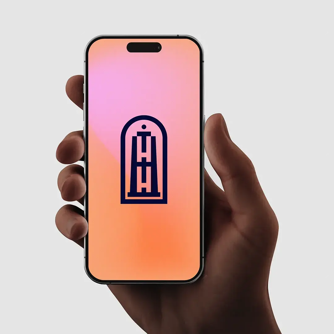
relying on generic charity tropes, we built the identity around a custom geometric mark
framed within a protective arch—packing multiple layers of meaning into a single,
recognizable form:
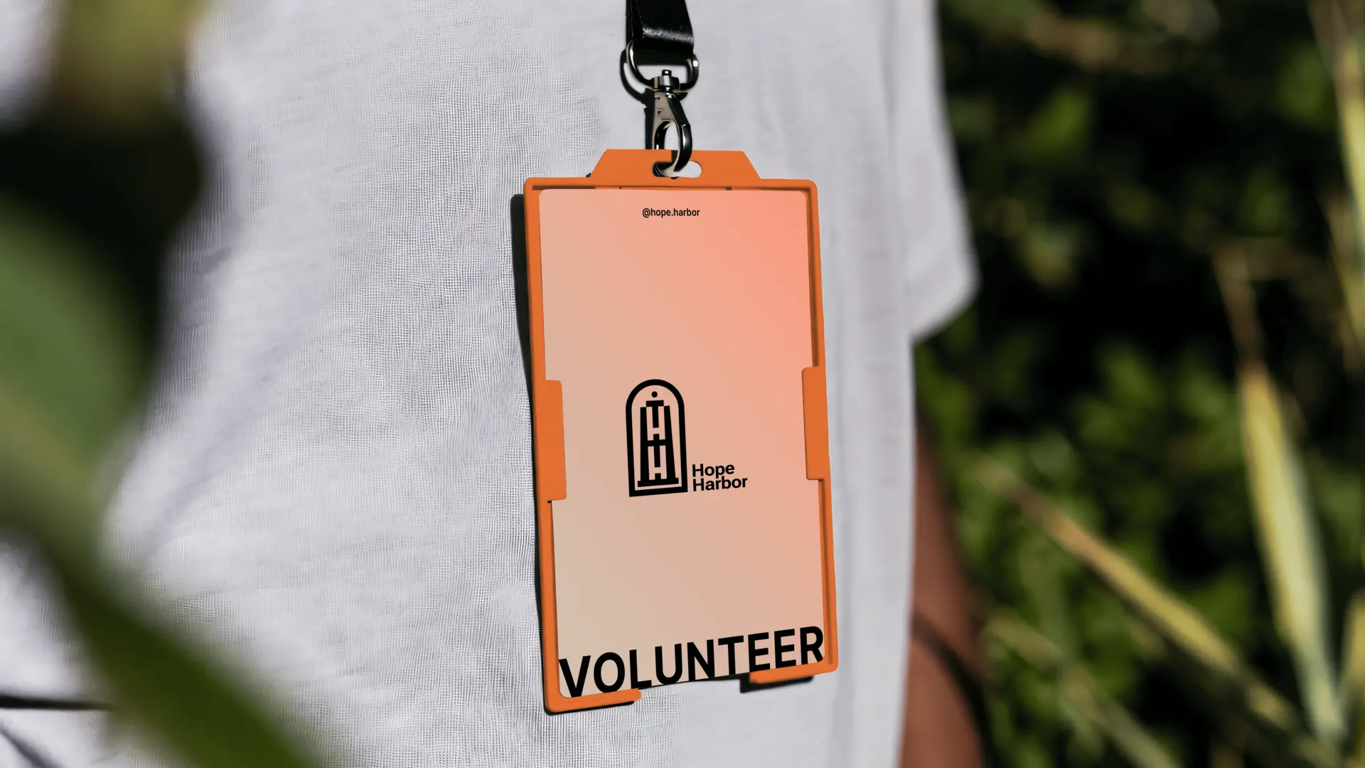
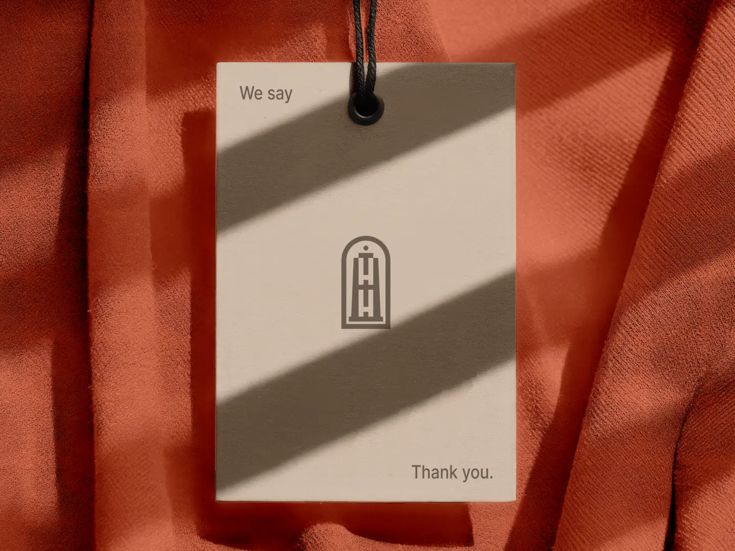
The Lighthouse:The overall silhouette takes the shape of a lighthouse, topped with a
single circular dot representing a guiding light—a beacon of direction and
safety.
The Stacked Monogram: Two 'H' letterforms are stacked vertically to form the tower's
structure, standing directly for Hope Harbor.
The Anchor of Hope: Where the two stacked 'H's meet in the center, their negative
space forms a subtle cross—symbolizing an anchor of hope and stability.
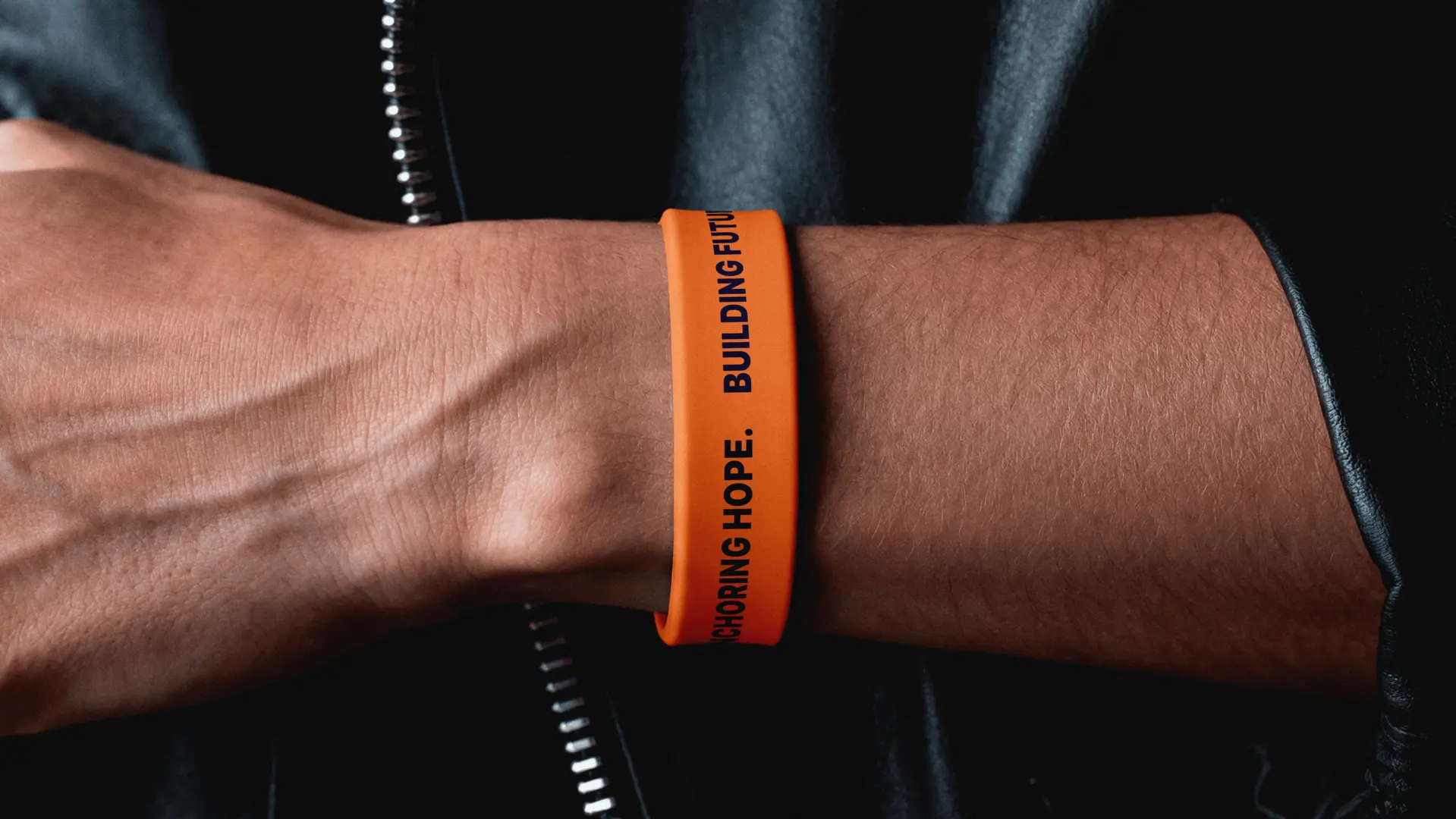
Pairing this architectural mark with clean, approachable typography and a warm, grounded
palette gives the organization a cohesive toolkit. From neighborhood flyers and mentor
handbooks to city billboards, every touchpoint feels consistent, human, and built to
connect.
The Result
A beacon for the community.
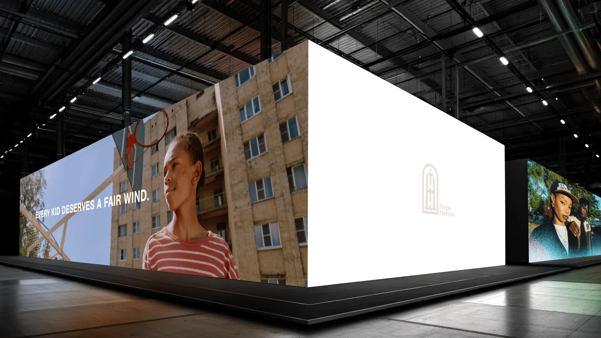
A distinct, heartfelt brand foundation that positions Hope Harbor as a trusted pillar in
Oakland. By balancing structural clarity with genuine warmth, the identity gives the team
the tools they need to rally donors, welcome mentors, and empower the next
generation.
Words from Hope Harbor