ARAPAI EAST.
Location
New Zealand
The Brief
To establish a foundational brand identity for a newly formed entity, creating a visual legacy that communicates purpose, permanence, and a clear sense of direction.

The Challenge
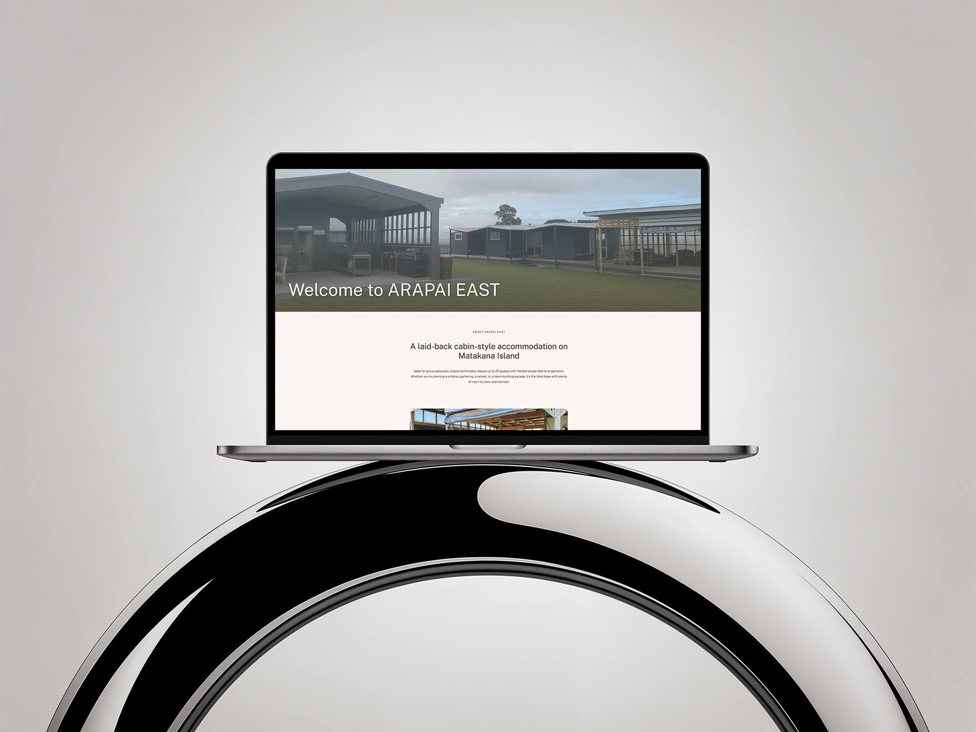
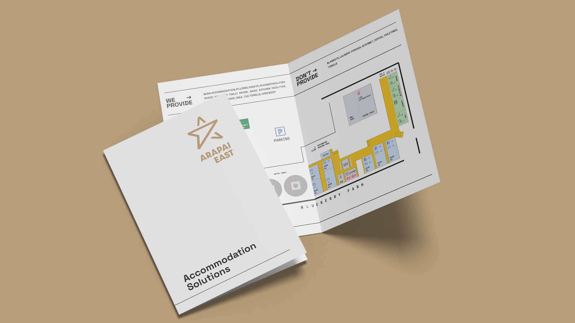
The Identity Foundation.
As a new arrival in the Bay of Plenty business landscape, Arapai East faced the "blank slate" challenge. They required more than just a mark; they needed a professional anchor that could command respect from day one. The objective was to synthesize a sense of "inner wisdom" and high-end quality into a brand that felt established rather than experimental.

The Idea
Guided Precision.
We looked to the horizon for inspiration, centering the visual narrative on the concept of
the Eastward direction. The resulting brand mark is a refined geometric intersection—a star
symbol that subtly integrates the letter ‘A’ while functioning as a compass. This minimalism
ensures the brand is easily recognized and scales across various physical and digital
applications.
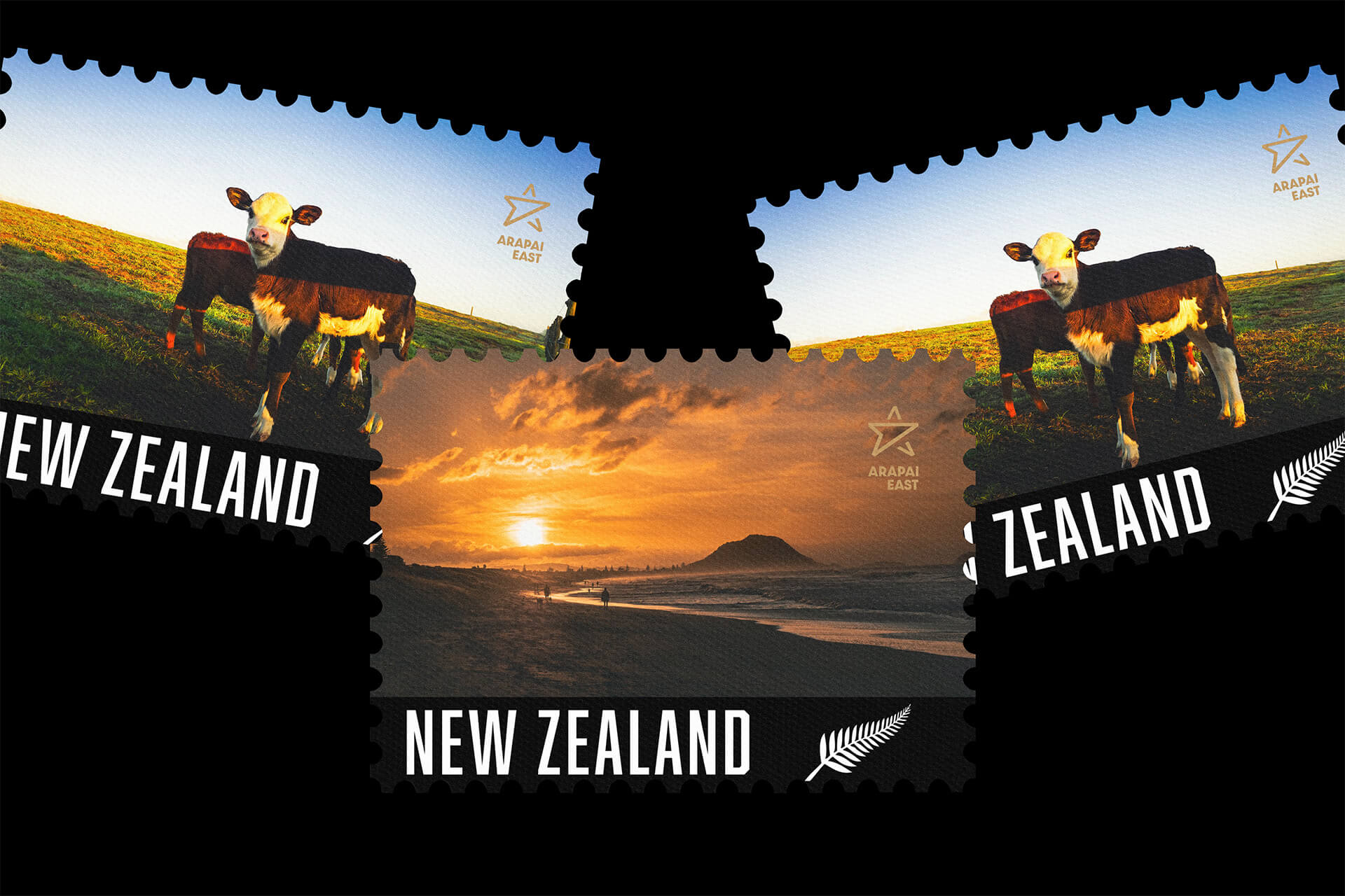
The color story departs from corporate neutrals, opting for a high-contrast pairing of deep
Black and Gold. Gold was chosen to symbolize quality and a generosity of spirit, while the
black provides a sharp, professional finish. This combination moves the brand away from the
typical and toward a more "heritage-lite" aesthetic, suggesting a company that values both
its roots and its future growth.
The Impact
A timeless, purposeful identity that positions a young company with the authority of a seasoned industry leader.
By translating the founding director’s vision into a structured design system, we gave
Arapai East a visual language that communicates its values without saying a word. The new
identity provides a solid platform for the company to proliferate its presence across New
Zealand, backed by a brand that feels as enduring as the land it operates on.

The Result